-
Curve Line
Regular price €35,00 EURRegular priceUnit price per -
Glyph Start
Regular price €25,00 EURRegular priceUnit price per -
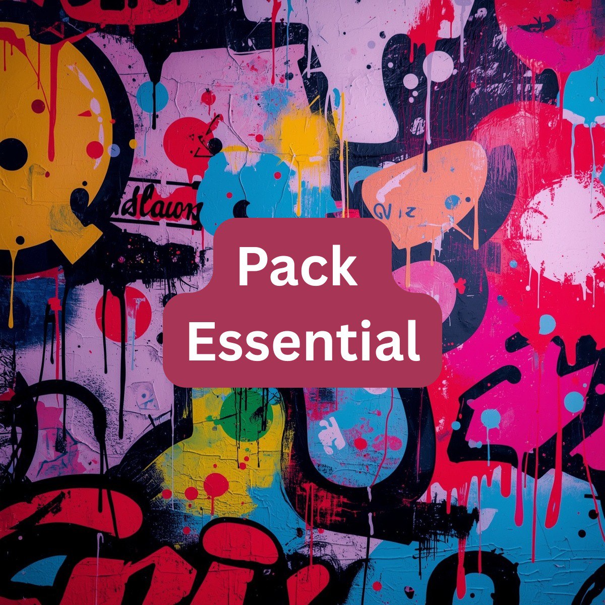
Pack Essential
Regular price €250,00 EURRegular priceUnit price per€0,00 EURSale price €250,00 EUR -
Pack Premium
Regular price €500,00 EURRegular priceUnit price per -
Silent Serif
Regular price €100,00 EURRegular priceUnit price per


Frequently Asked — Honestly Answered
What is the format of your fonts?
Our fonts are designed to work across a wide range of design projects — from print to digital layouts. Each collection is crafted with attention to style so you can confidently apply them in your visual concepts.
Can your fonts be used in commercial projects?
Yes, all of our courses are created with practical application in mind, including commercial use. You can use the fonts in your designs, branding, or presentations.
Are there limits on how many projects I can use a font in?
No, we don’t set a limit on project use. As long as you’re following the usage terms, you can include the font in as many personal or work-related projects as needed.
Can I get a recommendation on which font fits a specific project?
Yes, we’re always open to questions. Just message us with your idea and we’ll suggest a font that complements it best.
Guided by Form
We aim to give designers a tool that is not only functional but expressive. In a world where style is often reduced to trends, we seek depth. Our goal is to create fonts that don’t fade into the flow but add meaning. Each collection is a way to say something new while leaving space for your vision.
Born from the Letter
We are a team of designers who treat form like a voice. Marintiq was born from the desire to give letters a character that speaks on its own. In every font we build, there’s more than a shape — there’s an idea, a rhythm, and a mood that resonates with the project. We don’t aim to repeat — we create what leaves a visual imprint.
Why Choose Marintiq
-

Living Style
Each font is crafted to express emotion even in the briefest
word. -

Sharp Form
We focus on every line to make each composition expressive and
composed. -

Signature Touch
Every font is handcrafted — no templates, no
repeats. -

Free Choice
Our collections vary in tone, making it easy to find what your project truly needs.


Marintiq
Pack Essential

People Behind the Letters
-

Berry Taylor
Graphic Designer
He works with the outline, proportion, and weight of a typeface to achieve visual harmony. His job is to make each letter part of a unified style. -

Betty Cabrera
Rhythm Editor
She is responsible for consistency between styles within a collection. Her job is to set the visual pace so that the fonts "read" smoothly.


